Shopina Version 1.0
HTML Template For Online Store
- created: 20/10/2018
- latest update: 11/25/2018
- by: Mohsen khodaei
- email: support@arsesina.com
Installation
- Unzip the downloaded package and open the /shopina folder to find all the template files. You will need to upload these files to your hosting web server using FTP in order to use it on your website.
-
Below is the folder structure and needs to be uploaded to your website root directory:
-
shopina/css- Stylesheet files -
shopina/fonts– Icon font files -
shopina/media- Image and Video files files -
HTML/js- Javacript files -
shopina/Images– Patern and Images
-
- You should upload all or specific HTML files as per your need.
- You're now good to go..! Start adding your content/images and generate your beautiful brand new website for your awesome users.
HTML Structure
Shopina follows a simple and easy to customize coding structure. Here is the sample for your reference:
<!DOCTYPE html>
<html lang="en">
<head>
 <meta charset="UTF-8">
 <meta name="viewport" content="width=device-width, initial-scale=1, shrink-to-fit=no">
 <meta http-equiv="X-UA-Compatible" content="ie=edge">
 <title>Shopina | Paper Sofas</title>
 <link rel="stylesheet" href="css/master.css">
</head>
 <body>
 <div id="header" class="i_header">
 <div class="h_row">
 <!-- Logo -->
 <div class="h_logo">...</div>
 </div></div>
 <!-- Main Menu -->
 <nav class="navbar navbar-expand-lg navbar-light">...</nav>
 <!-- Main Content -->
 <div id="content">
 <div class="slider"></div>
 <div class="section Name">...</div>
 <div class="section Name">...</div>
 <div class="section Name">...</div>
 <!-- Footer -->
 <div id="footer">
 <div class="fo_top">...</div>
<div class="fo_bottom">...</div>
 <!-- Scripts -->
 <script src="js/lib/jquery-3.3.1.min.js"></script>
 <script src="js/lib/bootstrap.min.js"></script>
 <script src="js/lib/wow.min.js"></script>
 <script src="js/lib/owl.carousel.min.js"></script>
 <script src="js/lib/jquery.nicescroll.min.js"></script>
 <script src="js/lib/plyr.min.js"></script>
 <script src="js/main.js"></script>
 </body>
</html>
Header
Header Types
You can choose between 3 Types of headers while creating your Pages. The list of various header types & its descriptions are provided below for your reference:
1-white Header
Header with white background & dark text.

<div id="header" class="i_header">
 <div class="h_row">
 <div class="h_logo">
 <a href="#" class="mylogo indexheader" dideo-checked="true">
 <img src="imgages/index_header_logo.png" alt="shopine logo">
 </a>
 </div><div class="h_main_menu indexheader" style="position: relative;">
 <nav class="navbar navbar-expand-lg navbar-light" style="position: relative;"> ...</nav>
 <div class="h_menu">...</div>
 <div class="h_icons">...</div>
</div>
2-Hamburger menu Style

<div id="header" class="i_header s_header main_nav">
 <div class="h_row">
 <div class="h_logo">...</div>
 <div class="h_main_menu">...</div>
 <nav class="navbar navbar-expand-lg navbar-light">...</nav>
 <div class="h_icons">...</div>
 </div>
</div>
3-Header with Top Logo

<div id="header" class="pheader">
 <div class="h_row container">
 <div class="ph_description col-lg-4 roboto_medium">Shopina is The Best...</div>
 <div class="ph_logo col-lg-4 col-6"><a href="#" class="mylogo"><img src="imgages/footerlogo.png" alt="logo shopina"></a></div>
 <div class="h_menu col-lg-4 col-6">
 <ul>
 <li><a href="#" class="roboto_medium">Home</a><span>|</span></li>
 <li><a href="#" class="roboto_medium">Service</a><span>|</span></li>
 <li><a href="#" class="roboto_medium">About</a></li>
 </ul>
 </div>
 </div>
 <div class="main_nav">
 <div class="container">
 <div class="h_main_menu_all">
 <nav class="navbar navbar-expand-lg navbar-light">... </nav>
 <div class="mn_icons">...</div>
 </div>
 </div>
 </div>
</div>
Slider
To create different types of sliders or carousel , we use Owl Carousel 2

This is an example of how html is rendered. With the following options you can change almost every class the way you want.
<div class="owl-carousel owl-theme owl-loaded">
 <div class="owl-stage-outer">
 <div class="owl-stage">
 <div class="owl-item">...</div>
 <div class="owl-item">...</div>
 <div class="owl-item">...</div>
 </div>
 </div>
 <div class="owl-nav">
 <div class="owl-prev">prev</div>
 <div class="owl-next">next</div>
 </div>
 <div class="owl-dots">
 <div class="owl-dot active"><span></span></div>
 <div class="owl-dot"><span></span></div>
 <div class="owl-dot"><span></span></div>
 </div>
</div>
Options
refreshClass
Type: String
Default: owl-refresh
Class during refresh.
loadingClass
Type: String
Default: owl-loading
Class during load.
loadedClass
Type: String
Default: owl-loaded
Class after load.
rtlClass
Type: String
Default: owl-rtl
Class for right to left mode.
dragClass
Type: String
Default: owl-drag
Class for mouse drag mode.
grabClass
Type: String
Default: owl-grab
Class during mouse drag.
stageClass
Type: String
Default: owl-stage
Stage class.
stageOuterClass
Type: String
Default: owl-stage-outer
Stage outer class.
navContainerClass
Type: String
Default: owl-nav
Navigation container class.
navClass
Type: Array
Default: ['owl-prev','owl-next']
Navigation buttons classes.
dotClass
Type: String
Default: owl-dot
Dot Class.
dotsClass
Type: String
Default: owl-dots
Dots container class.
autoHeightClass
Type: String
Default: owl-height
Auto height class.
responsiveClass
Type: String|Boolean
Default: false
Optional helper class. Add '<responsiveClass>-<breakpoint>' class to main element. Can be used to stylize content on given breakpoint.
Animation
You may notice we have used some nice animation effects in this template. here is demo page of animations that you can use in this template. these animations are only supported by IE10+, Firefox, Google chrome, Safari, Opera. animations will be run when animated object displayed in viewport.
Usage
| Class Name | |||
|---|---|---|---|
| bounce | flash | pulse | rubberBand |
| shake | headShake | swing | tada |
| wobble | jello | bounceIn | bounceInDown |
| bounceInLeft | bounceInRight | bounceInUp | bounceOut |
| bounceOutDown | bounceOutLeft | bounceOutRight | bounceOutUp |
| fadeIn | fadeInDown | fadeInDownBig | fadeInLeft |
| fadeInLeftBig | fadeInRight | fadeInRightBig | fadeInUp |
| fadeInUpBig | fadeOut | fadeOutDown | fadeOutDownBig |
| fadeOutLeft | fadeOutLeftBig | fadeOutRight | fadeOutRightBig |
| fadeOutUp | fadeOutUpBig | flipInX | flipInY |
| flipOutX | flipOutY | lightSpeedIn | lightSpeedOut |
| rotateIn | rotateInDownLeft | rotateInDownRight | rotateInUpLeft |
| rotateInUpRight | rotateOut | rotateOutDownLeft | rotateOutDownRight |
| rotateOutUpLeft | rotateOutUpRight | hinge | jackInTheBox |
| rollIn | rollOut | zoomIn | zoomInDown |
| zoomInLeft | zoomInRight | zoomInUp | zoomOut |
| zoomOutDown | zoomOutLeft | zoomOutRight | zoomOutUp |
| slideInDown | slideInLeft | slideInRight | slideInUp |
| slideOutDown | slideOutLeft | slideOutRight | slideOutUp |
| heartBeat | |||
Animations
To animate an element, add the class animated to an element. You can include the class infinite for an infinite loop. Finally you need to add one of the following classes to the element:
Full example:
<h1 class="animated infinite bounce delay-2s">Example</h1>
Check out all the animations here!
It's possible to change the duration of your animations, add a delay or change the number of times that it plays:
.yourElement {
 animation-duration: 3s;
 animation-delay: 2s;
 animation-iteration-count: infinite;
}
Usage with jQuery
You can do a whole bunch of other stuff with animate.css when you combine it with jQuery. A simple example:
$('#yourElement').addClass('animated bounceOutLeft');
You can also detect when an animation ends:
// See https://github.com/daneden/animate.css/issues/644
var animationEnd = (function(el) {
 var animations = {
 animation: 'animationend',
 OAnimation: 'oAnimationEnd',
 MozAnimation: 'mozAnimationEnd',
 WebkitAnimation: 'webkitAnimationEnd',
 };
 for (var t in animations) {
 if (el.style[t] !== undefined) {
 return animations[t];
 }
 }
})(document.createElement('div'));
$('#yourElement').one(animationEnd, doSomething);
on how to use Animate.css with jQuery here.
$.fn.extend({
 animateCss: function(animationName, callback) {
 var animationEnd = (function(el) {
 var animations = {
 animation: 'animationend',
 OAnimation: 'oAnimationEnd',
 MozAnimation: 'mozAnimationEnd',
 WebkitAnimation: 'webkitAnimationEnd',
 };
 for (var t in animations) {
 if (el.style[t] !== undefined) {
 return animations[t];
 }
 }
 })(document.createElement('div'));
 this.addClass('animated ' + animationName).one(animationEnd, function() {
 $(this).removeClass('animated ' + animationName);
 if (typeof callback === 'function') callback();
 });
 return this;
 },
});
jQuery.one() is used when you want to execute the event handler at most once. More information here.It's possible to extend jQuery and add a function that does it all for you:
And use it like this:
$('#yourElement').animateCss('bounce');
or;
$('#yourElement').animateCss('bounce', function() {
 // Do something after animation
});
Setting Delay and Speed
Delay Class
It's possible to add delays directly on the element's class attribute, just like this:
<div class="animated bounce delay-2s">Example</div>
| Class Name | Delay Time |
|---|---|
| delay-2s | 2s |
| delay-3s | 3s |
| delay-4s | 4s |
| delay-5s | 5s |
Slow, Slower, Fast, and Faster Class
It's possible to control the speed of the animation by adding these classes, as a sample below:
<div class="animated bounce faster">Example</div>
| Class Name | Speed Time |
|---|---|
| slow | 2s |
| slower | 3s |
| fast | 800ms |
| faster | 500ms |
ICON
We use two font Icon in this themplate. Flat-icon font and awesome;
1-Flat-Icon
How to use flat-icon coustom font:
Use the icon class on "display: inline" elements:
Use example:
<i class="flaticon-plant"></i> or <span class="flaticon-plant"></span>

2-Awesome-Icon
Product Category
Product categories are the primary way to group products with similar features.

you can see category list, code structure here:
 <!-- Category -->
 <div class="container">
 <div class="ci_parent col-md-4">
 <div>
 <img src="media/category/category_item_1.jpg" alt="one">
 <div class="p_o_bottom">
 <div class="p_o_b_left">
 <div class="roboto_medium"><a>Lucky Chair</a></div>
 <div class="roboto_regular"><a>Best Categories</a></div>
 </div>
 <div class="p_o_b_right roboto_bold">
 $112
 <i class="fas fa-shopping-cart"></i>
 </div>
 </div>
 </div>
 </div>
...
 <div class="ci_itemPage">
 <div class="ci_itemPage_back">
 <span class="ci_showPageNumber">1</span>
 <span class="ci_nextOrPrevBtn prevBtn"><i class="flaticon-left"></i>PRE</span>
 <span class="ci_itemPage_currentPage">2</span>
 <span class="ci_nextOrPrevBtn nextBtn">NEXT<i class="flaticon-right-arrow-angle"></i></span>
 <span class="ci_showPageNumber">10</span>
 </div>
 </div>
 </div>
Blog
Shopina contains all required Styles to create fully working and oriented blog.
Style 1:Left Image
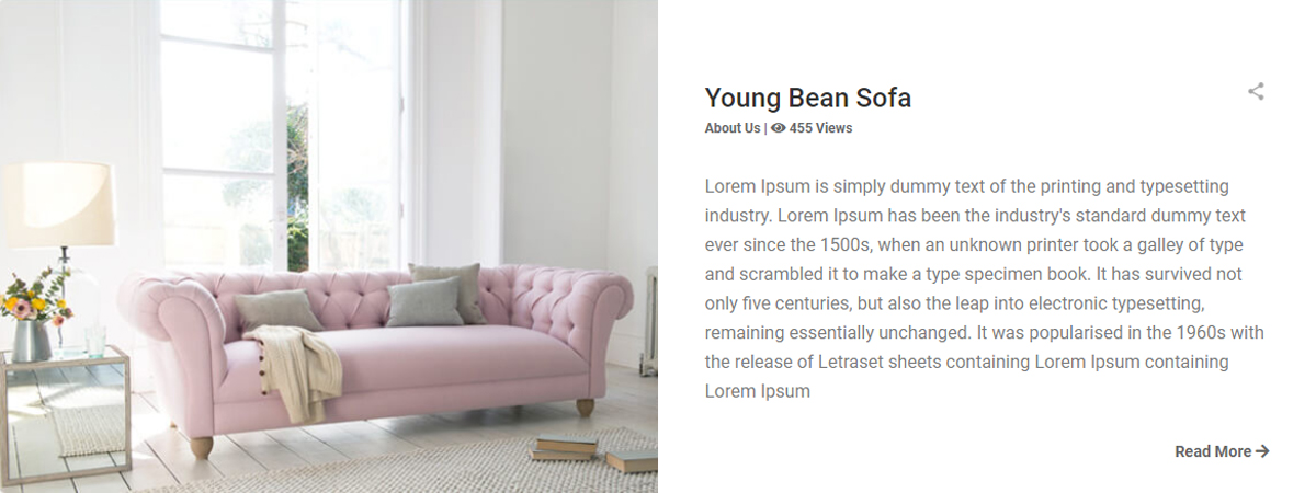
<div class="bg_view1 with-sidebar">
 <div class="bg_view1_left col-md-6 col-12"><img src="media/blog/blog_post_img1.jpg" alt="post 1">
 </div>
 <div class="bg_view1_right col-md-6 col-12">
 <div class="vr_1 roboto_medium"><a href="#" dideo-checked="true"><h2>Young Bean Sofa</h2><i class="share_icon_blog"></i></a>
 </div>
 <div class="vr_2 roboto_bold"><span><a dideo-checked="true">About Us</a></span> | <span><i class="fas fa-eye"></i> 455 Views</span>
 </div>
 <p class="vr_3 roboto_regular">Lorem Ipsum is simply dummy text of the printing and typesetting industry. Lorem Ipsum has been the industry's...
 </p>
 <div class="vr_4 roboto_bold"><a dideo-checked="true">Read More <i class="fas fa-arrow-right"></i></a></div>
 </div>
 <div class="clearfix"></div>
 </div>
Style 2:Buttom Full Image

<div class="bg_view2 with-sidebar">
 <div class="bg_view2_top">
 <div class="vr_1 roboto_medium"><a href="#" dideo-checked="true"><h2>Young Bean Sofa</h2><i class="share_icon_blog"></i></a>
 </div>
 <div class="vr_2 roboto_bold"><span>10 SEP</span> | <span><i class="fas fa-eye"></i> 455 Views</span></div>
 <p class="vr_3 roboto_regular">Lorem Ipsum is simply dummy text of the printing and
 typesetting
 industry. Lorem Ipsum has been the industry's standard dummy text ever since the 1500s, when
 an
 unknown printer took a galley of type and scrambled it to make a type specimen book. It has
 survived not only five centuries, but also the leap into electronic typesetting, remaining
 essentially unchanged. It was popularised in the 1960s with the release of Letraset sheets
 containing Lorem Ipsum passages, and more recently with desktop publishing software like
 Aldus
 PageMaker including versions of Lorem Ipsum.
 </p>
 <div class="vr_4 roboto_bold"><a dideo-checked="true">Read More <i class="fas fa-arrow-right"></i></a></div>
 </div>
 <div class="bg_view2_bottom">
 <img src="media/blog/blog_post_img2.jpg" alt="view 2">
 </div>
 </div>
Style 3:Media Post
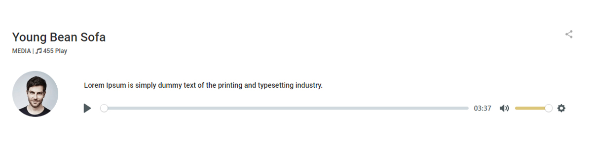
<div class="bg_view3 with-sidebar">
 <div class="vr_1 roboto_medium"><a href="#" dideo-checked="true"><h2>Voice Of Customers</h2><i class="share_icon_blog"></i></a>
 </div>
 <div class="vr_2 roboto_bold"><span>MEDIA</span> | <i class="fas fa-music"></i> 455 Play
 </div>
 <div class="vr_3 roboto_regular">
 <div class="bg3_vr_3_left"><img src="media/index/customer.png" alt="author"></div>
 <div class="bg3_vr_3_right">
 <h4 class="roboto_medium">Lorem Ipsum is simply dummy text of the printing and typesettingindustry.</h4>
 <div class="plyr plyr--full-ui plyr--audio plyr--html5 plyr--paused plyr--stopped plyr--is-touch">
<div class="plyr__controls"><button type="button" class="plyr__control" data-plyr="play" aria-label="Play">
<svg class="icon--pressed" role="presentation" focusable="false"><use xlink:href="#plyr-pause"></use></svg>
<svg class="icon--not-pressed" role="presentation" focusable="false"><use xlink:href="#plyr-play"></use>
</svg><span class="label--pressed plyr__sr-only">Pause</span><span class="label--not-pressed plyr__sr-only">Play</span>
</button><div class="plyr__progress">...</div>
 </div>
 <div class="clearfix"></div>
 </div>
 </div>
Style 4:Grid Post View

<div class="bg_view4_back">
 <div class="col-md-6 col-12">
 <div class="bg_view4">
 <div class="view4_top"><img src="media/blog/blog_post_img4.jpg" alt="view 4"></div>
 <div class="view4_botton">
 <div class="vr_1 roboto_medium"><a href="#" dideo-checked="true"><h2>Young Bean Sofa</h2><i class="share_icon_blog"></i></a></div>
 <div class="vr_2 roboto_bold"><span><a dideo-checked="true">About Us</a></span> | <span><i class="fas fa-eye"></i> 455 Views</span>
 </div>
 <p class="vr_3 roboto_regular">Lorem Ipsum is simply dummy text of the printing and
 typesetting industry. Lorem Ipsum has been the industry's standard dummy text ever
 since the 1500s, when an unknown printer...
 </p>
 <div class="vr_4 roboto_bold"><a dideo-checked="true">Read More <i class="fas fa-arrow-right"></i></a></div>
 </div>
 </div>
 </div>
 <div class="col-md-6 col-12">
 <div class="bg_view4">
 <div class="view4_top"><img src="media/blog/blog_post_img3.png" alt="view 4"></div>
 <div class="view4_botton">
 <div class="vr_1 roboto_medium"><a href="#" dideo-checked="true"><h2>Young Bean Sofa</h2><i class="share_icon_blog"></i></a></div>
 <div class="vr_2 roboto_bold"><span><a dideo-checked="true">About Us</a></span> | <span><i class="fas fa-eye"></i> 455 Views</span>
 </div>
 <p class="vr_3 roboto_regular">Lorem Ipsum is simply dummy text of the printing and
 typesetting industry. Lorem Ipsum has been the industry's standard dummy text ever
 since the 1500s, when an unknown printer...
 </p>
 <div class="vr_4 roboto_bold"><a dideo-checked="true">Read More <i class="fas fa-arrow-right"></i></a></div>
 </div>
 </div>
 </div>
 <div class="clearfix"></div>
 </div>
Style 5:Qutoe Style

<div class="qute">
 <div class="vr_1 roboto_medium"><a href="#" dideo-checked="true"><h2>Young Bean Sofa</h2><i class="share_icon_blog"></i></a>
 </div>
 <div class="vr_2 roboto_bold"><span><a dideo-checked="true">10 SEP</a></span> | <span><i class="fas fa-eye"></i> 455 Views</span>
 </div>
 <div class="vr_3 roboto_light_italic">
 <span class="icon_back">
 <i class="qute_icon"></i>
 </span>
 <span class="qute_text">
 Lorem Ipsum is simply dummy text of the printing and typesetting
 industry. Lorem Ipsum has been the industry's standard dummy text ever since the 1500s, when an
 unknown printer took a galley of type and scrambled it to make.
 </span>
 </div>
 <div class="vr_4 roboto_bold"><a dideo-checked="true">M.KHODAEI</a></div>
 </div>
Source & Credits
CSS Files theme
JavaScripts
Js files theme